Marqeta provides customizable components that enable your cardholders to securely activate their cards, display card and account details, view their recent transaction history and otherwise manage their cards in your customer application. These fully compliant, accessible UI components are part of UX Toolkit. They are a low-code implementation that you can add to your customer application as native web components in order to provide extended functionality to your cardholders. All PCI data elements are securely injected using iframes. Each of the available UI components is described below. You are encouraged to experiment with the interactive components described on this page—no account is required. Using the Studio environment, you can try out various configuration values for theme object properties such as colors and font attributes. See below for instructions on how to get started with Studio. For detailed instructions on how to begin working with UX Toolkit, including installation, embedding a component, authentication, and creating a session in Marqeta’s hosted card management system, see UX Toolkit Getting Started.
Note
Compliant with the Payment Card Industry Data Security Standard (PCI DSS), UX Toolkit reduces your burden of achieving data security compliance by providing a PCI-compliant way to allow cardholders to perform certain actions; however, you have other responsibilities regarding data security for other elements of your cardholder experience. Contact your Marqeta representative for details or see Concepts.
Important
This version of UX Toolkit supports only prepaid and debit card programs in the United States.

Designing a theme with Studio

Studio is an interactive theming environment where you can fine-tune the appearance of the UX Toolkit UI components before integrating them in your customer application. For example, with Studio, you can preview and test the look-and-feel of the UI components you integrate in your customer application on various device types including mobile phone, tablet, and desktop. While in Studio, you can click into each component to access all available functionality. The components each have an Overview icon Overview page and a Customize icon Customize page that are linked together, so that any changes made on the Customize page carry over to the Overview page. You can choose to work in Studio with or without authenticating:
  • If you choose to authenticate, you will populate Studio with your program’s details and data instead of using the default option of Studio-simulated data.
  • If you do not authenticate, you can work with simulated data that is provided.
Important
To work in Studio while authenticated, contact your Marqeta representative to obtain the Auth Params CLI script for your Auth Params. To run the Auth Params CLI script, you will need Node.js v16 (or later) installed and the items described below.
NameDescriptionHow to Obtain
Client IDYour OAuth client identifier.Contact your Marqeta representative to obtain this identifier.
Private PEM file nameYour private Privacy Enhanced Mail (PEM) file name. This file should live in the same directory as the Auth Params CLI script. Do not share this PEM file externally.

It is recommended to store your private key in a secure infrastructure and update the path to your key in the Auth Params CLI script.
The file name is created when generating your RSA key pair. For more information, see Generate your RSA key pair.
User tokenUnique identifier of the user account holder.

For more information, see Authentication.

Allowable Values: 36 char max
Send a POST request to the /users endpoint to generate a user token, as described in Users.
OAuth URLThe OAuth URL used for the client assertion.Use one of these URLs, depending on the environment you are using:

- <a href="https://ux-toolkit-api-sandbox.marqeta.com">https://ux-toolkit-api-sandbox.marqeta.com</a>
- <a href="https://ux-toolkit-api.marqeta.com">https://ux-toolkit-api.marqeta.com</a>
The example cURL below uses the Auth Params CLI script:
cURL
node path/to/generateAuthParams.js \
  31zwLe6r342ntY5SegHNA5FPbYQLeu-0NUoViHZ1fj453 \
  test_private_key.pem \
  test_user_token \
  https://ux-toolkit-api-sandbox.marqeta.com \
  true

Authenticate when working with Studio

To authenticate when working with Studio, follow these steps:
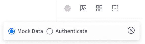
UX Toolkit Authentication in Studio
1
Access the Studio page.
2
In the upper-left corner of the screen, click the Authentication icon icon to load the modal window.
3
Select the Authenticate option button.
4
Enter the Auth Params, then click the Authenticate button. When the icon turns green, you know that you have successfully switched to authenticated mode.

Editing and sharing an existing Studio theme

If you are part of a collaborative effort building a theme and want to share your work with others, you can do so by sharing the theme as a file in JSON format. Consider hosting a copy of your theme’s JSON file in your source control repository for safekeeping so you can monitor any incremental changes made to it by team members. Keeping a copy of your theme’s JSON file also enables you to quickly update your application’s theme whenever necessary, as explained below. Your Studio theme is not applied to your card product or program until you upload it to the Marqeta platform by sending a POST request to the /theme endpoint. You cannot download and edit a Studio theme once it has been uploaded to the Marqeta platform. The Marqeta platform does not retain a version history of your theme’s JSON file. To edit the locally saved copy of your theme’s JSON file, follow these steps:
1
Paste your theme’s JSON content into Studio.
2
Make your modifications directly in the Studio interface.
3
Save the JSON file locally or in your source control repository, per the procedures in place.
4
Upload the JSON file to the Marqeta platform to overwrite the existing theme.
UX Toolkit does not limit you to a single theme per card program. You can define multiple themes, and apply a different theme to each card product in your program, for example. The only limitation is that all themes you create for a given card program must be assigned a unique name.
Note
If you close or refresh the browser tab where Studio is running, your customized theme values will be lost. Similarly, if you choose to authenticate with Studio, you will be logged out after closing or refreshing the Studio tab.
For further assistance with theming using the Studio environment, access Studio directly.

Account component

Tip
The UI components on this page are interactive modules, not screen captures! You can try them out here now — no need to create an account.
The UX Toolkit’s Account component enables you to display an account balance and show your cardholders their account details:
  • View account balance: Displays the available balance of the cardholder account, which is the balance in the ledger minus any authorized transactions that have not yet cleared.
  • View deposit account details: Enables your cardholders to view the type of account, routing number, and account number of the underlying deposit account, then copy the details if needed.
  • Download statements: Enables your cardholders to view and download the available statements in their account.

Properties/Attributes

FieldsDescription
user-state

string

Optional
Fetches account data related to the user (demo for various user states). Only available in mock mode, not when authenticated.

Allowable Values:

ACTIVE, LIMITED, SUSPENDED, UNVERIFIED, CLOSED, NO_DEPOSIT_ACCOUNTS, LOADING

Events

Event NameDescription
mqAccountActionCompletedTriggered when the ViewDetails modal has finished loading or failed to load.
mqAccountActionHookTriggered when an account action is initiated, such as selecting the Add Money button or the Link Card button.
mqAccountActionTriggeredTriggered when the ViewDetails modal has begun loading.
mqAccountLoadCompletedTriggered when the Account component has returned account data or failed to return account data.
mqAccountLoadInitiatedTriggered when the Account component is connected to the Document Object Model (DOM).

Card management components

With UX Toolkit’s family of card management components, you can manage your program’s cards through these common cardholder operations:

Activate Card component

Tip
The UI components on this page are interactive modules, not screen captures! You can try them out here now — no need to create an account.
The PCI-compliant Activate Card component allows your account holders to activate a new card. With this UI component, you can toggle the component’s title and description. In the authenticated cardholder experience, a valid cardToken associated with the userToken must be used to generate the UI component and activate the card.

Properties/Attributes

FieldsDescription
card-token

string

Required
Unique identifier for the card.

Allowable Values:

Valid card token (max 36 char)
show-title

boolean

Optional
Toggle to display the title of the UI component.

Allowable Values:

true, false
show-description

boolean

Optional
Toggle to display the description of the UI component.

Allowable Values:

true, false

Events

Event NameDescription
mqActivateCardActionCompletedTriggered when the activate card submission has completed successfully or failed.
mqActivateCardActionHookTriggered when the Done button is selected from either the Success or Error views.
mqActivateCardActionTriggeredTriggered when the activate card submission is initiated.
mqActivateCardLoadCompletedTriggered when the Activate Card component finishes loading successfully or failed to load.
mqActivateCardLoadInitiatedTriggered when the Activate Card component is connected to the Document Object Model (DOM).

Card List component

Tip
The UI components on this page are interactive modules, not screen captures! You can try them out here now — no need to create an account.
With the UX Toolkit’s Card List component, cardholders can select a card from their list of cards to take actions on. This UI component will emit events to notify you whenever the cardholder selects a card. Use this event to route the customer to the respective card action component. Although terminated cards are displayed, you should prevent your cardholders from managing their card or viewing their card details. Do not route your cardholders to the Card Actions component because they will have no actions available to them.

Properties/Attributes

No configurable properties or attributes are currently available for this UI component.

Events

Event NameDescription
mqCardListActionHookTriggered when one of the cardholder’s cards has been selected.
mqCardListLoadCompletedTriggered when the Card List component loads successfully or fails to load.
mqCardListLoadInitiatedTriggered when the Card List component is connected to the Document Object Model (DOM).

Set PIN component

Tip
The UI components on this page are interactive modules, not screen captures! You can try them out here now — no need to create an account.
The PCI-compliant Set PIN component allows cardholders to set a four-digit personal identification number (PIN) for their card. With this UI component, you can toggle the component’s title and description. In the authenticated cardholder experience, a valid cardToken associated with the userToken must be used to generate the UI component and set or change the card’s PIN.

Properties/Attributes

FieldsDescription
card-token

string

Required
Unique identifier for the card.

Allowable Values:

Valid card token (max 36 char)
show-title

boolean

Optional
Toggle to display the title of the UI component.

Allowable Values:

true, false
show-description

boolean

Optional
Toggle to display the description of the UI component.

Allowable Values:

true, false

Events

Event NameDescription
mqSetPinActionCompletedTriggered when the set PIN action has completed successfully or failed.
mqSetPinActionHookTriggered when the Done button is selected from either the Success or Error views.
mqSetPinActionTriggeredTriggered when the set PIN action is initiated.
mqSetPinLoadInitiatedTriggered when the Set PIN component has started loading.
mqSetPinLoadCompletedTriggered when the Set PIN component has finished loading successfully or failed to load.

Reveal PIN component

Tip
The UI components on this page are interactive modules, not screen captures! You can try them out here now — no need to create an account.
The PCI-compliant Reveal PIN component allows your cardholders to view their card’s four-digit personal identification number (PIN). Before the cardholder can view their PIN, you must explicitly reauthenticate the cardholder, passing the value corresponding to whichever supplemental method was used to verify the cardholder’s identity (cardholderVerificationMethod) to Marqeta. The PIN will automatically be hidden from view after the configured display time has elapsed. With this UI component, you can toggle the component’s title.

Properties/Attributes

FieldsDescription
card-token

string

Required
Unique identifier for the card.

Allowable Values:

Valid card token (max 36 char)
cardholder-verification-method

string

Optional
The supplemental method used to verify the cardholder’s identity before revealing the card’s personal identification number (PIN).

The possible cardholder verification methods are:

- BIOMETRIC_FACE: In-app authentication via facial recognition
- BIOMETRIC_FINGERPRINT: In-app authentication via biometric fingerprint
- EXP_CVV: In-app authentication by entering the card’s expiration date and card verification value (CVV)
- LOGIN: In-app authentication by re-entering the app password
- OTP: Two-factor authentication involving a one-time password (OTP)
- OTP_CVV: Two-factor authentication involving the card’s CVV and an OTP
- OTHER: Authentication that relies on other secure methods

Allowable Values:

BIOMETRIC_FACE, BIOMETRIC_FINGERPRINT, LOGIN, EXP_CVV, OTP_CVV, OTP, OTHER
show-title

boolean

Optional
Toggle to show the title of the UI component.

Allowable Values:

true, false
timeout

number

Optional
Period of time after which the cardholder’s PIN will be automatically hidden from view on the cardholder’s screen as a security precaution. Expressed in seconds.

Allowable Values:

5-15

Default Value:
10

Events

Event NameDescription
mqRevealPinActionCompletedTriggered when the Reveal PIN or Hide PIN action has completed.
mqRevealPinActionTriggeredTriggered when the Reveal PIN action is initiated.
mqRevealPinLoadInitiatedTriggered when the Reveal PIN component starts loading.
mqRevealPinLoadCompletedTriggered when the Reveal PIN component has finished loading.

Card component

Tip
The UI components on this page are interactive modules, not screen captures! You can try them out here now — no need to create an account.
The PCI-compliant Card component allows cardholders to view and copy their card details to the clipboard. With this UI component, you can toggle the component’s title. In the authenticated cardholder experience, a valid cardToken associated with the userToken must be used to generate the UI component and view the card’s details.
Warning
Card data is less secure when copied to the clipboard than when left in a PCI-compliant component. Cardholders should adopt data security best practices and take precautions to keep their sensitive data safe.

Properties/Attributes

FieldsDescription
card-token

string

Required
Unique identifier for the card.

Allowable Values:

Valid card token (max 36 char)
can-change-sides

boolean

Required
Indicates whether the card can be flipped.

Allowable Values:

true, false
default-side

string

Optional
If the value for can-change-sides is true, then this property determines which side will be shown as default.

Allowable Values:

front, back
short-code

string

Optional
Unique short code. A value for this property is only required when the program supports multiple short codes.

Allowable Values:

Valid program short codes, separated by commas
show-cardholder-name

boolean

Optional
Flag that decides whether the card displays the cardholder name or not.

Allowable Values:

true, false

Events

Event NameDescription
mqCardLoadInitiatedTriggered when the Card component begins loading.
mqCardLoadCompletedTriggered when the cards either load successfully or fail to load.
mqCardActionTriggeredTriggered when the cardholder requests to view the front or the back of the card.
mqCardActionCompletedTriggered when the card action request has failed.

Replace Card component

Tip
The UI components on this page are interactive modules, not screen captures! You can try them out here now — no need to create an account.
With the UX Toolkit’s Replace Card component, cardholders can replace their card if it is lost, stolen, or damaged. Cardholders can also update their mailing address to ensure that the replacement card is sent to the correct address.

Properties/Attributes

FieldsDescription
card-token

string

Required
Unique identifier for the card.

Allowable Values:

Valid card token (max 36 char)
show-success

boolean

Optional
Enables or disables the confirmation success message.

Allowable Values:

true, false
delivery-time

string

Optional
Indicates an approximate delivery time to cardholders.

Allowable Values:

64 char max
show-title

boolean

Required
Flag that decides whether the title is shown or not.

Allowable Values:

true, false
show-description

boolean

Required
Flag that decides whether the description of the UI component is shown or not.

Allowable Values:

true, false

Events

Event NameDescription
mqReplaceCardLoadInitiatedTriggered when the Replace Card component begins loading.
mqReplaceCardLoadCompletedTriggered when the Replace Card component has loaded successfully or failed to load.
mqReplaceCardActionTriggeredTriggered when the Replace Card button is selected.
mqReplaceCardActionCompletedTriggered when the replace card action has completed successfully or failed.
mqReplaceCardActionHookTriggered when the Done button is selected from either the Success or Error views.

Card Actions component

Tip
The UI components on this page are interactive modules, not screen captures! You can try them out here now — no need to create an account.
With the UX Toolkit’s Card Actions component, you can offer your cardholders a convenient, central location to manage their card: This component dynamically displays card actions based on the card’s state. For example, if the cardholder’s card is unlocked, the Lock Card option and toggle will be shown to the cardholder. The Lock/Unlock Card action displayed by this UI component is directly actionable here by the cardholder. The other card actions, such as View PIN, appear to the cardholder as shortcuts used to access other UI components. These card action shortcuts are designed to emit events that notify you whenever they are selected by the cardholder. You then use these events to route the cardholder to the appropriate UI component. For example, if the cardholder selects the Replace Card option, the event will contain details including the actionId, and cardToken. Route the cardholder using these details to the Replace Card component.
Tip
Set the cardToken value to bbbbbbbb-bbbb-bbbb-bbbb-000000000000 if you want to test a generic error within the Card Actions component.

Properties/Attributes

FieldsDescription
card-token

string

Required
Unique identifier for the card.

Allowable Values:

Valid card token (max 36 char)

Events

Event NameDescription
mqCardActionsInitTriggered when the Card Actions component is connected to the Document Object Model (DOM).
mqCardActionsLoadErrorTriggered when the set of available card actions fails to load.
mqCardActionsLoadSuccessTriggered when the set of available card actions loads successfully.
mqCardActionsLockCardErrorTriggered when a card cannot be locked.
mqCardActionsLockCardSuccessTriggered when a card is locked successfully.
mqCardActionsSelectActionErrorTriggered when a card action event cannot be initiated.
mqCardActionsSelectActionSuccessTriggered when a card action event begins successfully.
mqCardActionsSelectActionTriggeredTriggered when a card action event is initiated.
mqCardActionsUnlockCardErrorTriggered when a card cannot be unlocked.
mqCardActionsUnlockCardSuccessTriggered when a card is unlocked successfully.

Lock/Unlock Card action

Part of the Card Actions component, the Lock/Unlock Card action enables your cardholders to temporarily disable their card to prevent unauthorized use. With this action, your cardholders can quickly and easily protect their card if they lose it or suspect fraudulent activity. By locking their card this way, they can immediately stop any unauthorized transactions, reducing financial risk.
Tip
Consider advising your cardholders to immediately lock their card as a temporary solution in the event that they misplace it. Locking the misplaced card while they search provides a quick solution without the need to report it as lost or stolen.

Events

The events for this UI component are given in the Events section of the Card Actions component above.

Account Funding (money movement) components

By including the UX Toolkit’s Account Funding feature in your application, you can enable your cardholders to add their external payment cards as linked funding sources for the account they have with you. Your cardholders can then pull funds into their account from the external cards they linked. Implementing the Account Funding feature involves multiple UX Toolkit components: The external card types that can be used for linking are debit and prepaid cards issued by either Visa or Mastercard.
Note
The scope of the UX Toolkit’s Account Funding components is limited to pulling funds into your Marqeta account over card rails.

External Account List component

Tip
The UI components on this page are interactive modules, not screen captures! You can try them out here now — no need to create an account.
The PCI-compliant External Account List component enables your cardholders to manually enter the details of their supported external payment card and link it to the account they have with you on your application. By linking their external card to their account using this UI component, your cardholders are defining a funding source that they can use to move funds from their external cards to their account with you.

Properties/Attributes

FieldsDescription
show-title

boolean

Required
Flag that decides whether the title is shown or not.

Allowable Values:

true, false

Events

Event NameDescription
mqExternalAccountListActionCompletedTriggered when the unlink card action has been successfully completed or results in failure.
mqExternalAccountListActionHookTriggered when the Done button is selected from the Error view or when the Add linked account button is selected from the Normal view.
mqExternalAccountListActionTriggeredTriggered when the unlink card action is initiated.
mqExternalAccountListLoadCompletedTriggered when the list of linked accounts has loaded correctly or fails to load.
mqExternalAccountListLoadInitiatedTriggered when the External Account List component starts loading.
Tip
The UI components on this page are interactive modules, not screen captures! You can try them out here now — no need to create an account.
The Link External Card component enables your cardholders to perform various management operations on the external cards they have linked to the account they have on your application. Cardholders can use this UI component to view or unlink their linked external cards. They can also link additional external cards to their account here.

Properties/Attributes

No configurable properties or attributes are currently available for this UI component.
FieldsDescription
show-title

boolean

Required
Flag that decides whether the title is shown or not.

Allowable Values:

true, false
show-description

boolean

Optional
Toggle to display the description of the UI component.

Allowable Values:

true, false

Events

Event NameDescription
mqLinkExternalCardActionCompletedTriggered when the external card was linked successfully or failed to link.
mqLinkExternalCardActionHookTriggered when the Done button is selected.
mqLinkExternalCardActionTriggeredTriggered when the link external card action is initiated.
mqLinkExternalCardLoadCompletedTriggered when the Link External Card component has completed all requests for the initial view.
mqLinkExternalCardLoadInitiatedTriggered when the Link External Card component is mounted.

Transfer Funds component

Tip
The UI components on this page are interactive modules, not screen captures! You can try them out here now — no need to create an account.
The Transfer Funds component enables your cardholders to move funds from one of their linked external cards to the account they have on your application. If your account holder has more than one linked external card, the UI component prompts them to choose the funding source from their list of linked external cards before moving the funds into the account. If the account holder has only one linked external card, the UI component allows them to move the funds right away.

Properties/Attributes

FieldsDescription
show-title

boolean

Required
Flag that decides whether the title is shown or not.

Allowable Values:

true, false

Events

Event NameDescription
mqTransferFundsActionCompletedTriggered whenever the fund transfer action has completed, regardless of whether it was successful or failed.
mqTransferFundsActionHookTriggered when the Done button is selected, regardless of whether the funds transfer was successful or failed.
mqTransferFundsActionTriggeredTriggered when the Add $<amount> button is selected.
mqTransferFundsLoadCompletedTriggered when the Transfer Funds component is loaded successfully.
mqTransferFundsLoadInitiatedTriggered when the Transfer Funds component is connected to the Document Object Model (DOM).

Statements component

Tip
The UI components on this page are interactive modules, not screen captures! You can try them out here now — no need to create an account.
This component is lengthy; don’t forget to scroll to view to the very end.
The Statements component provides your cardholders with the ability to view and download the monthly statements for their account. Cardholders can view the available statements in their account and choose to download the statement for the period that interests them. Provided in PDF format, the downloadable statements indicate the account’s starting and ending balance, as well as a list of all transactions that were posted during the statement period. The description, location, and amount are provided for each transaction included in the statement.

Properties/Attributes

No configurable properties or attributes are currently available for this UI component.

Events

Event NameDescription
mqStatementListLoadInitiatedTriggered when the Statements component is connected to the Document Object Model (DOM).
mqStatementListLoadCompletedTriggered when the Statements component has returned account data.
mqStatementListActionTriggeredTriggered when loading the statements list is initiated.
mqStatementListActionCompletedTriggered when the funds transfer request succeeds or fails.

File Dispute component

Tip
The UI components on this page are interactive modules, not screen captures! You can try them out here now — no need to create an account.
The File Dispute component gives your cardholders the ability to create disputes for fraud and many kinds of transactions without involving a call center agent or other channel. Implementing this UI component in your application minimizes the need for your cardholders to contact you when they want to dispute a transaction posted to their account. This UI component guides your cardholder through a series of questions, capturing all relevant details before initiating a dispute with the card network on behalf of your cardholder. The scope of the UX Toolkit’s File Dispute UI component is limited to the following kinds of disputes:
  • Fraud: A dispute where the cardholder suspects fraud.
  • Consumer disputes: A dispute where the cardholder did not receive the goods or service they paid for, or the goods or service they received were damaged.
  • Processing disputes: A dispute where there is something incorrect in the transaction processing, such as the cardholder being charged twice or being charged in an incorrect currency.
With the File Dispute component, your cardholders will be able to initiate a dispute on a settled transaction.

Properties/Attributes

FieldsDescription
transaction-token

string

Required
Unique identifier for the transaction.

Allowable Values:

36 char max
show-title

boolean

Required
Flag that decides whether the title is shown or not.

Allowable Values:

true, false
show-success-and-failure-states

boolean

Required
Flag that decides whether the success and failure states are shown or not.

Allowable Values:

true, false

Events

Event NameDescription
mqFileDisputeActionCompletedTriggered when the file dispute action has completed successfully or failed to complete.
mqFileDisputeActionHookTriggered when the Done button is selected from either the Success or Error views.
mqFileDisputeActionTriggeredTriggered when the file dispute action is initiated.
mqFileDisputeLoadCompletedTriggered when the File Dispute component finishes loading successfully or fails to load.
mqFileDisputeLoadInitiatedTriggered when the File Dispute component starts loading.

Onboarding form

Tip
The UI components on this page are interactive modules, not screen captures! You can try them out here now — no need to create an account.
This component is lengthy; don’t forget to scroll to view to the very end.
With the UX Toolkit’s Know Your Customer (KYC) and Know Your Business (KYB) Onboarding component, applicants can sign up for an account with you. This UI component creates a user account on the Marqeta platform, and then performs KYC and KYB (EU) identity verification. This UI component is only applicable if your program is using Marqeta’s KYC/KYB (EU) solution.
Note
Some Marqeta card programs require account holders residing in the United States and the EU to pass KYC or KYB (EU) identity verification before being allowed to transact. KYC/KYB (EU) verification is also required for the proprietors, officers, and beneficial owners of businesses in the United States and the European Union.

Properties/Attributes

FieldsDescription
disclosures

array

Required
Array containing disclosure information. Each item of the array contains a title element (in string format) and a src element (a URL).

Allowable Values:

Valid array
verificationType

string

Required
Type of verification flow. The default value for this field is kyc.

Allowable Values:

kyc, kyb

Events

Event NameDescription
mqOnboardAccountHolderActionCompletedTriggered when a user action, such as submitting a form, has completed.
mqOnboardAccountHolderActionHookTriggered to hook into the action lifecycle, signaling the successful or unsuccessful completion of specific steps.
mqOnboardAccountHolderActionTriggeredTriggered when a user action, such as submitting a form, is initiated.
mqOnboardAccountHolderLoadCompletedTriggered when the KYC/Onboarding component has finished loading and is connected to the Document Object Model (DOM).
mqOnboardAccountHolderLoadInitiatedTriggered when the KYC onboarding process is initiated.

Transaction List component

Tip
The UI components on this page are interactive modules, not screen captures! You can try them out here now — no need to create an account.
This component is lengthy; don’t forget to scroll to view to the very end.
The UX Toolkit’s Transaction List component gives you the ability to provide your cardholders with a comprehensive view of their transaction history, including pending and cleared transactions, merchant name, date, and transaction type. The Transaction List component handles the complex logic required to display the transaction history that is relevant to cardholders. By integrating the Transaction List component in your application, your cardholders will be able to:
  • View a history of the transactions and payment activities they have performed over the past 90 days.
  • View the description, status, date, type, and amount of the transactions in the history.

Properties/Attributes

FieldsDescription
show-title

boolean

Required
Toggle to display the title of the UI component.

Allowable Values:

true, false

Events

Event NameDescription
mqTransactionListActionCompletedTriggered when the transaction list action has completed.
mqTransactionListActionTriggeredTriggered when the transaction list action is initiated.
mqTransactionListHookTriggered when a hook is initiated.
mqTransactionListLoadCompletedTriggered when the Transaction List component has completed all network requests for the initial view.
mqTransactionListLoadInitiatedTriggered when the Transaction List component is mounted.

Transaction component

Tip
The UI components on this page are interactive modules, not screen captures! You can try them out here now — no need to create an account.
The UX Toolkit’s Transaction component gives you the ability to provide your cardholders with a detailed view of a specific transaction. By integrating this UI component in your application, your cardholders will be able to:
  • View the description, status, amount, and date for an individual transaction
  • View the status of a dispute they initiated

Properties/Attributes

FieldsDescription
transaction-token

string

Required
Unique identifier for the transaction.

Allowable Values:

Valid user token (max 36 char)
show-report-problem-cta

string

Required
Configures when to display the Report a problem button.

Allowable Values:

NEVER, DISPUTABLE, ALWAYS

Events

Event NameDescription
mqTransactionHookTriggered when a hook is initiated.
mqTransactionLoadCompletedTriggered when the Transaction component has completed all network requests for the initial view.
mqTransactionLoadInitiatedTriggered when the Transaction component is mounted.