- Retrieve data using filters.
- Download data in CSV format and, for large amounts of data, with Gzip compression.
- Add visualizations to reports to enhance data presentation.
- Define periodic reports using relative date filters on saved reports.
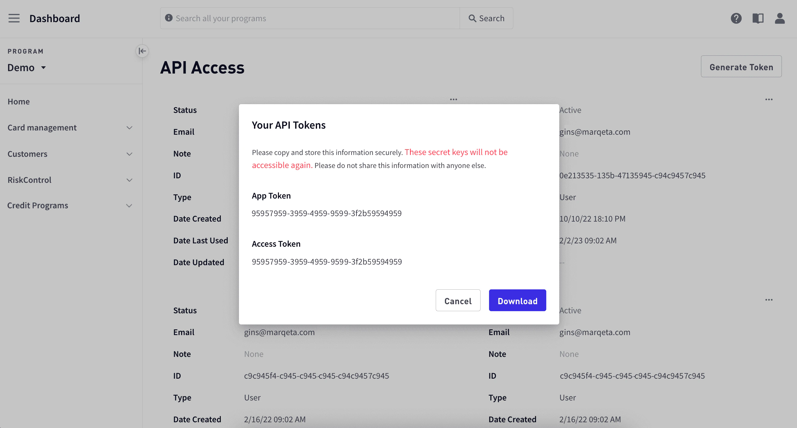
- Generate your user tokens to access the DiVA API.
The basics
To access Reports, go to the Marqeta Dashboard, select Data & Insights in the upper-left corner, then select Reports in the sidebar. The following figure shows Reports: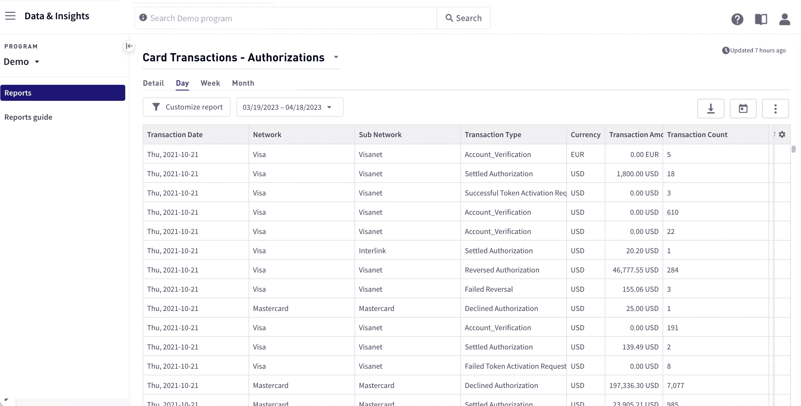
Data sync times
Report data, such as clearing and settlement data, is synchronized three times each day. For specific times, see Expected refresh and settlement timelines.How to…
- View a report
- Manage the number of retrieved rows
- Filter data
- Create a visualization
- Create DiVA API access tokens
Report types
You can view the following report types:Balance
Balance reports give you detailed information on cardholder balances, such as starting and ending balances and chargebacks.Card transactions
Card transaction reports provide details on card transactions derived from the transaction-related messages sent to and from the Marqeta platform.Other transactions
Other transactions reports give you detailed information about transactions other than card transactions, including ACH, bill payments, and direct deposit.Credit
Credit reports give you detailed information about your credit programs, including information on credit accounts, cards, disputes, ledgers, payments, and current statements.Program stats
Program stats reports give you detailed information about your card programs, such as when a card was created and activated.Risk monitoring
Risk monitoring reports give you information on risk, such as chargebacks and KYC. For details, see Risk monitoring in Reports In-depth.System
System reports give you information on system health and performance. For details, see System in Reports In-depth.Utilities
Utilities reports provide information on the data dictionary, which describes the data for each of the columns. For details, see Utilities in Reports In-depth.Data Products & Insights
Data Products & Insights provides several reports for improving the customer experience for your cardholders. These reports include Bank Files, Authorization and Clearing Comparison Detail, and Quarterly Network Reports. For more information, see Data Products and Insights.RiskControl Real-Time Decisioning
RiskControl Real-Time Decisioning reports provide information on Real-Time Decisioning behavior. For details, see RiskControl Real-Time Decisioning in Reports In-depth.Which reports to use
Curious which report to use for a particular process? The table below summarizes some of the main reporting needs that are addressed and the report to use for each.Accessing reports
Reports are grouped by report type. To access a report:1
Select Data & Insights in the upper-left corner, then select Reports in the sidebar.
2
From the dropdown list at the top, select a report.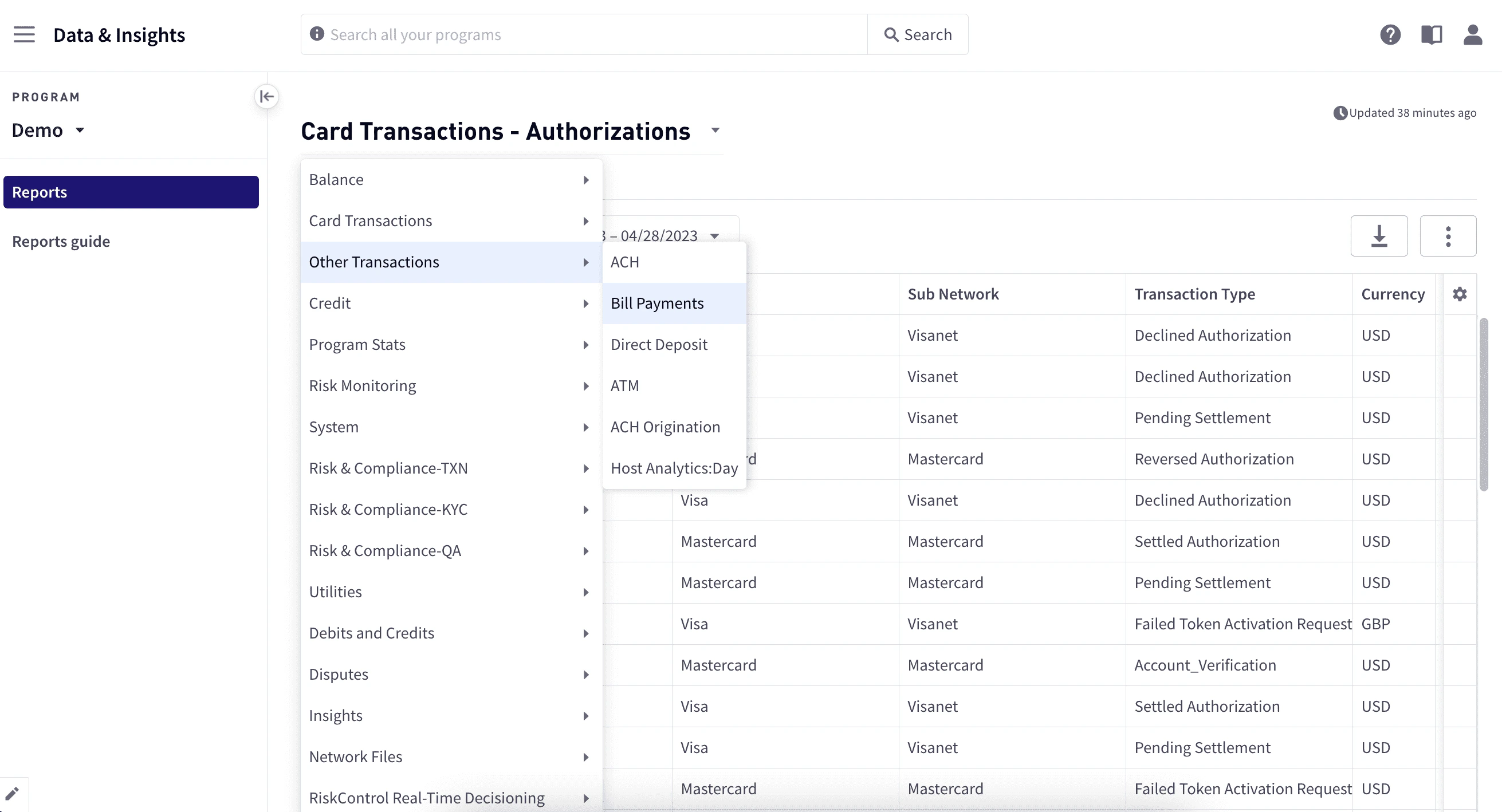
3
To cancel a report in progress, select the Cancel request button.
Viewing data
Use filters, sorting, grouping, and visualizations to uncover whatever data points you want to explore. You can download data to work with it offline or to save your custom reports for future access.Data freshness indicator
The Data Freshness Indicator provides up-to-date information on when your data was last updated, enabling you to begin your workflows with the certainty that all recent data has been loaded. Basic load information is displayed in the upper-right corner. Hover the pointer over the Clock icon to view a tooltip that includes additional details. The information is presented in your local time zone: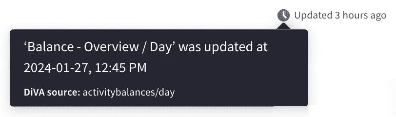
Exposed and data views
Because the amount of data exposed through the user interface can be unwieldy, two view types are provided to help you work with the data:- Exposed view – This is initially set at 10,000 rows with the option to add rows in increments of 100,000.
- Data view – The complete set of records for the fully specified table build.
Managing the number of retrieved rows
The default number of rows retrieved when you open a report is 10,000. To retrieve the next 100,000 rows, select Get more data at the bottom of the report view area. Because the dataset may be too large to practically load into your browser, you can download the full dataset:- At the upper-right of the report view area, select the Download Current Report button. The complete set of records in the data view is downloaded in Gzip compression format. The dataset may take some time to generate before the download begins.
Working with the exposed view
When you open a report, the exposed view shows a subset of the columns for the underlying data view, as well as a subset of the data. You can interact with the data by using quick filters, by sorting and reordering columns, or by adding and removing columns.Managing columns
To include or exclude columns or to rearrange the column order:1
Select Modify columns from the gear icon in the upper-right corner to open the Customize Columns dialog box.
2
To define which columns should appear in the report, select or clear the checkbox for the columns to include or exclude. To select or deselect all columns, use Select all or Remove all.
3
To reorder the columns, drag them up or down to their new positions.
4
Select Save.
Customizing a report
You can customize a report by filtering or sorting the data, or by creating a pivot table to group the data. You can filter by date or use operators to filter by specific columns. Customizing a report allows you to work with the entire data view, applying to the entire underlying data view; however, only the exposed view is returned and displayed. To customize a report:1
To modify the columns to include, see Managing columns.
2
Select Customize report in the upper left of the view area.
3
In the Customize report panel, choose the programs to include in the Program selector box.
4
To apply filters:
- Under Filter select a column, select a relational operator to use, then enter a value. See Relational operator behavior.
- To add more filters, repeat the above step.
- To remove a filter, select the x to the right of the filter or Clear all to remove them all.
5
To sort the report by column values, select the column under Sort and the direction, ASC or DESC. To remove the sort, select Clear all.
6
To group your data by defining a pivot table:
- Under Pivot table select Activate pivot table.
- Select Add group and choose the column. To add additional columns, repeat this step.
- To remove a grouping, select the x to the right of the filter or select Clear all to remove them all.
7
Select Apply.
8
To return to the default view, select Reset table to default from the gear icon in the upper left of the view area.
1
Select the calendar box at the upper left.
2
Select a data range either by selecting one of the preset date ranges, or by selecting a start and end date.
3
Select Apply.
4
To return to the default view, select Reset table to default using the gear icon.
Relational operator behavior
Filter behavior for relational operators depends on the type of information for the selected column:Saving reports
To save a report:1
Select Save Current Report.
2
Enter a report name.
3
Select Save.
Visualizations
Visualizations help you understand your data. Using visualizations, you can create charts based on the data you have retrieved and include them in a report. The available options depend on the visualization type. Note that visualizations apply to the exposed view of your data.Visualization types
The following visualizations are available:Line chart
A line chart displays information as a series of data points connected by straight line segments. A line chart is most frequently used to show trends and analyze how data has changed over time. Typically, the y-axis displays a quantitative value, and the x-axis provides a timescale or a sequence of intervals.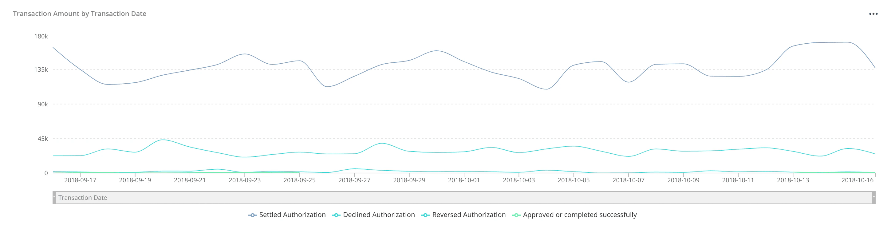
To add a line chart:
1
Retrieve the data you want to include.
2
Select Visualization Controls and select Line Chart. The most likely columns are displayed in the initial graph.
3
Select ··· in the upper-right corner of the chart and select the options.
4
To save the chart, select Save.
Bar chart
A bar chart presents data using rectangular bars that are proportional to the values that they represent. A bar chart can be used to compare changes over a period of time for more than one group.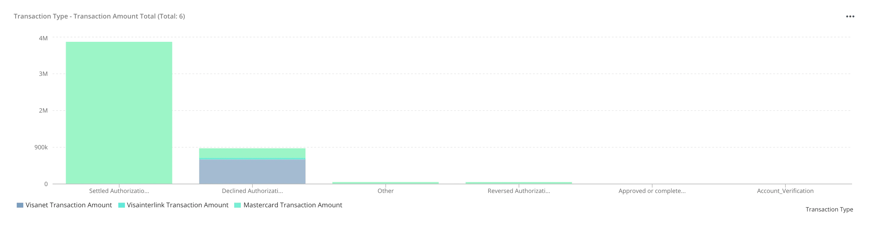
To add a bar chart:
1
Retrieve the data you want to include.
2
Select Visualization Controls and select Bar Chart.
3
In the upper-right corner of the visualization, select ··· and then select the options.
4
Select Save.
Scatter plot
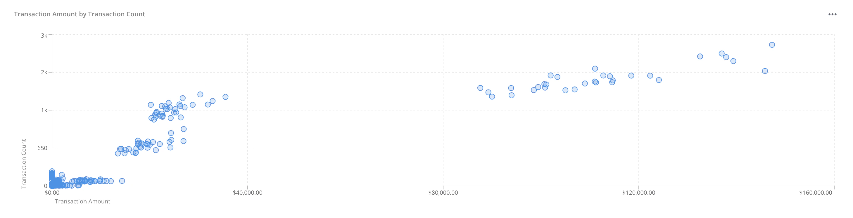
A scatter plot displays values as a collection of points, where the value of one variable determines the position on the x-axis and the value of the other variable determines the position on the y-axis. A scatter plot shows how much one variable is affected by another. The relationship between the two variables is called their correlation. A scatter plot is useful when:- You have paired numerical data.
- Your dependent variable has multiple values for each value of your independent variable.
- You want to determine whether two variables are related.
1
Retrieve the data you want to explore.
2
Select Visualization Controls and select Scatter Plot. Only number columns are available for both the x-axis and y-axis. The default columns to display in the graph are the first two active numerical columns.
3
To change the columns to display in the graph, select ··· in the upper-right corner of the chart and select the columns for each axis. You can choose only one column for each axis.
Creating your DiVA API access tokens
Reports in the Marqeta Dashboard accesses the same data endpoints as the DiVA API. Using the Dashboard, you can generate your DiVA API access tokens to use when making API calls. You will have the same permission level as you have in the Dashboard. To generate your access tokens:1
In the upper-right corner, select your username and choose DiVA API access.
2
On the API Access page, select Generate Token in the upper-right corner.
3
In the Add a Note popup window, enter a note you want to associate with your access tokens, and select Generate. After DiVA generates your access tokens, the API Tokens popup window appears and displays your tokens.
4
Select Download to save your tokens.